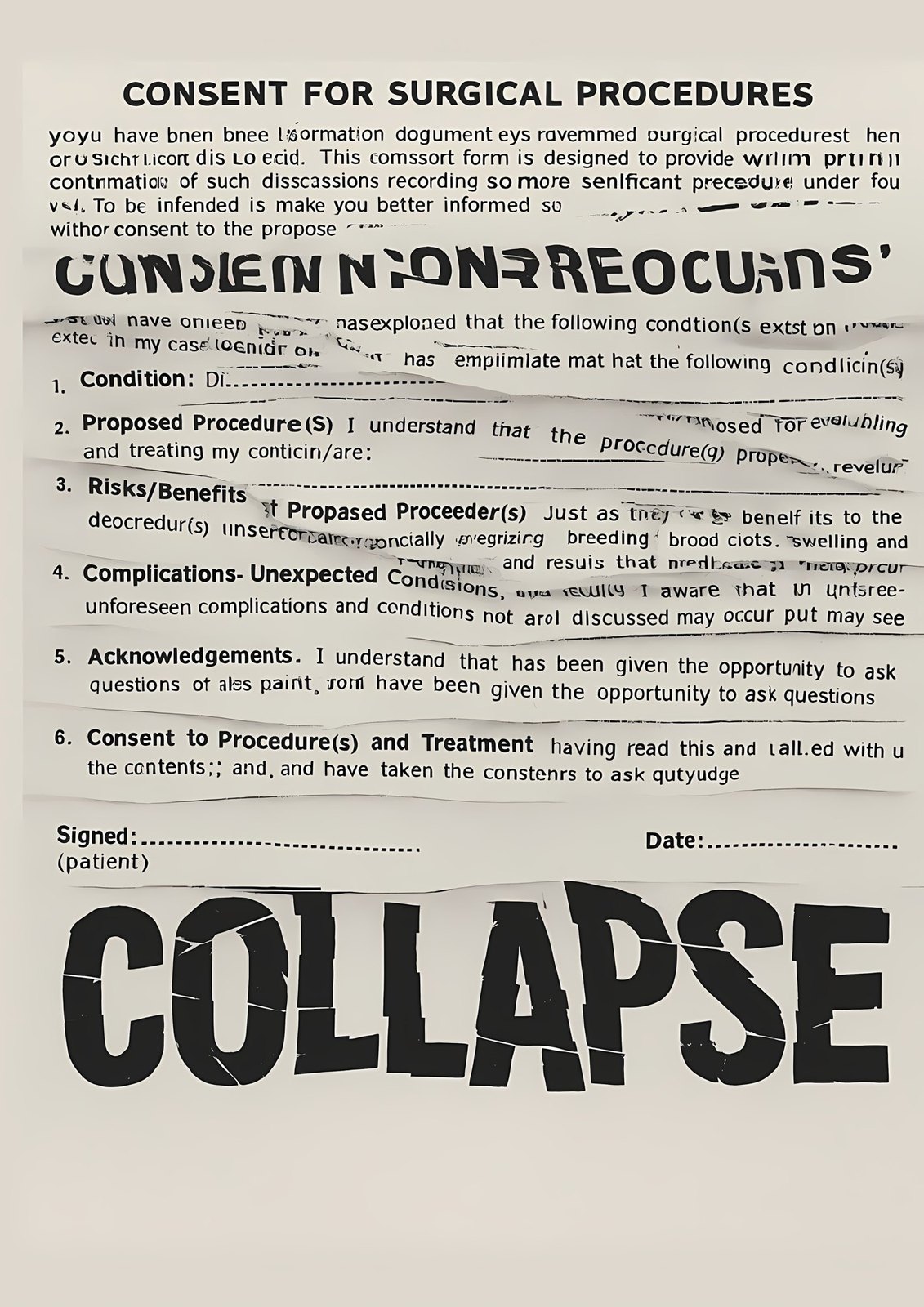
Bodily autonomy is still decided by politics, religion and medicine — and the language of forms and case files makes that feel normal.
Concept, research, all 15 posters, six animations, exhibition design. Solo master’s project.
Series exhibited at UMCS Lublin; nominated for the Peru Biennial 2026; the visual system now lives on this site.
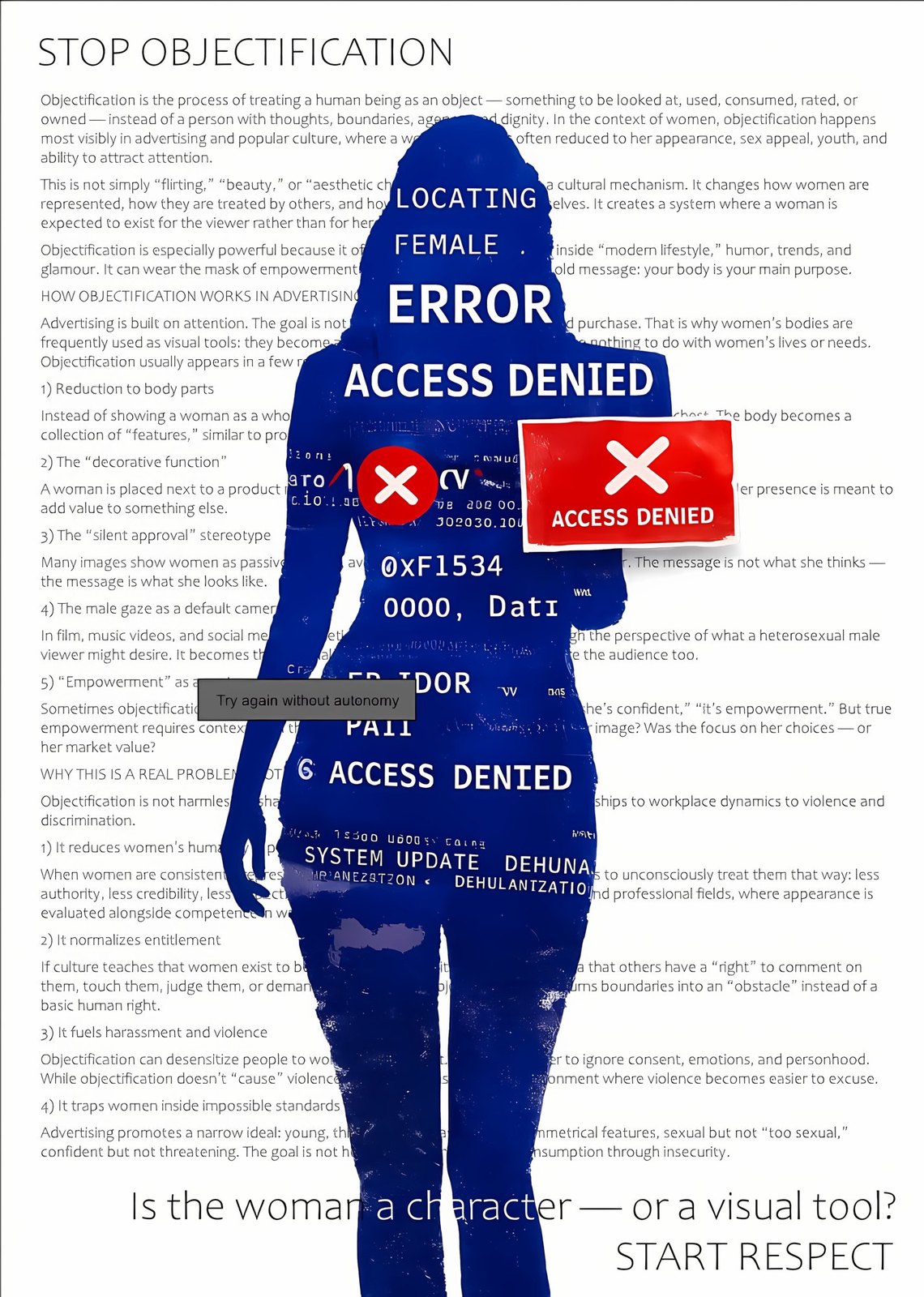
Reproductive rights and bodily autonomy — the right to decide, to contraception, to safety, to one’s own voice — remain objects of political, religious and medical control. Protests in Poland, Iran, the United States and Latin America show that a woman’s body is treated as territory to be managed. It is also a place of resistance.
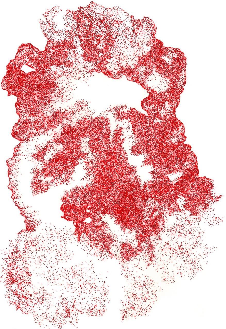
What the system treats as “a case” gets back its voice, its body and its name. Red, drop by drop, returns to where it was erased.
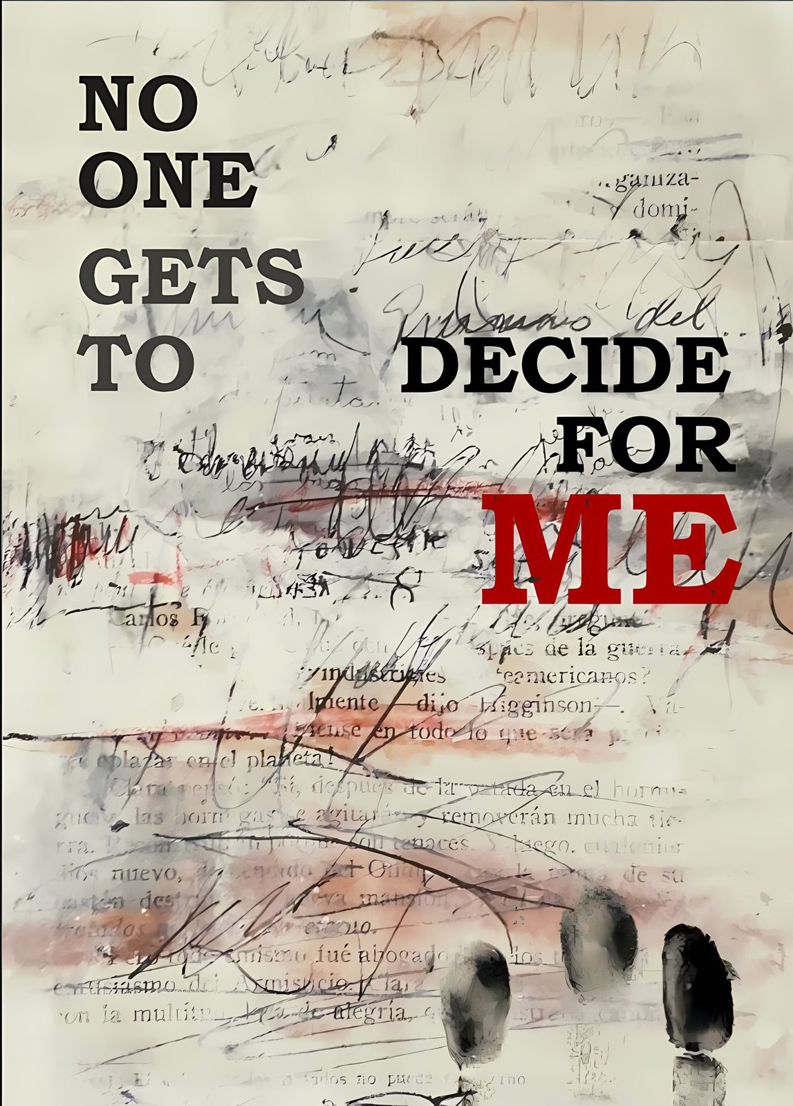
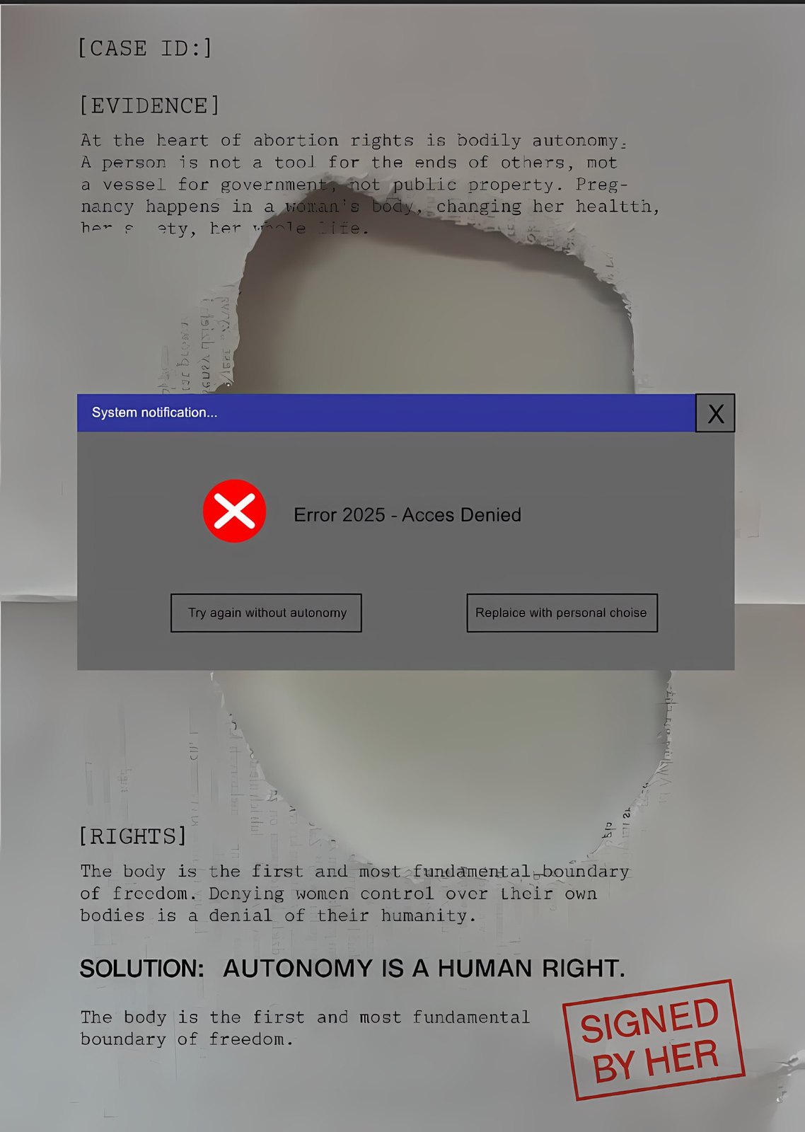
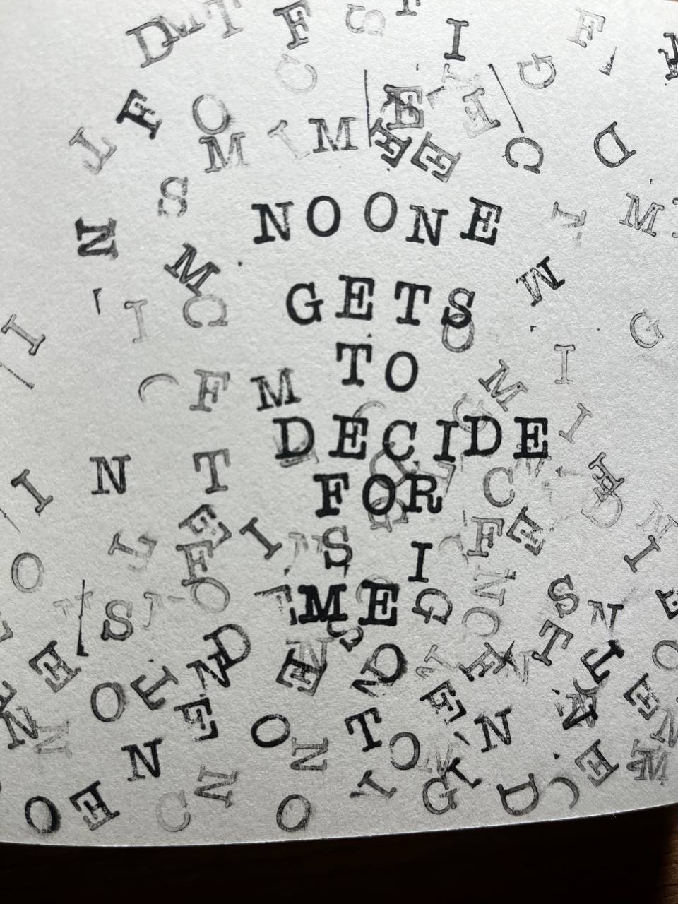
“No one gets to decide for me” — the sentence every poster echoes.
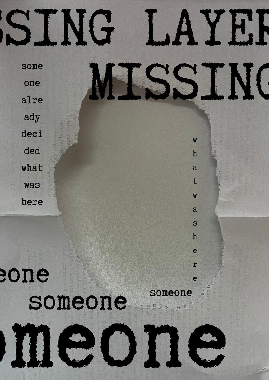
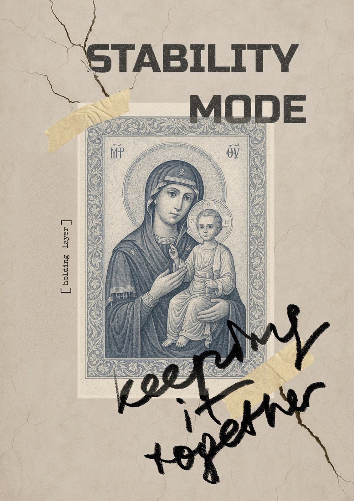
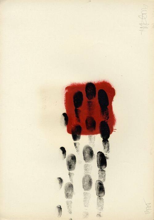
Matter. Old crumpled kraft paper and cardboard, cracks, tears, blots, fingerprints, newsprint. The surface carries traces of body and time — it is evidence, not background.
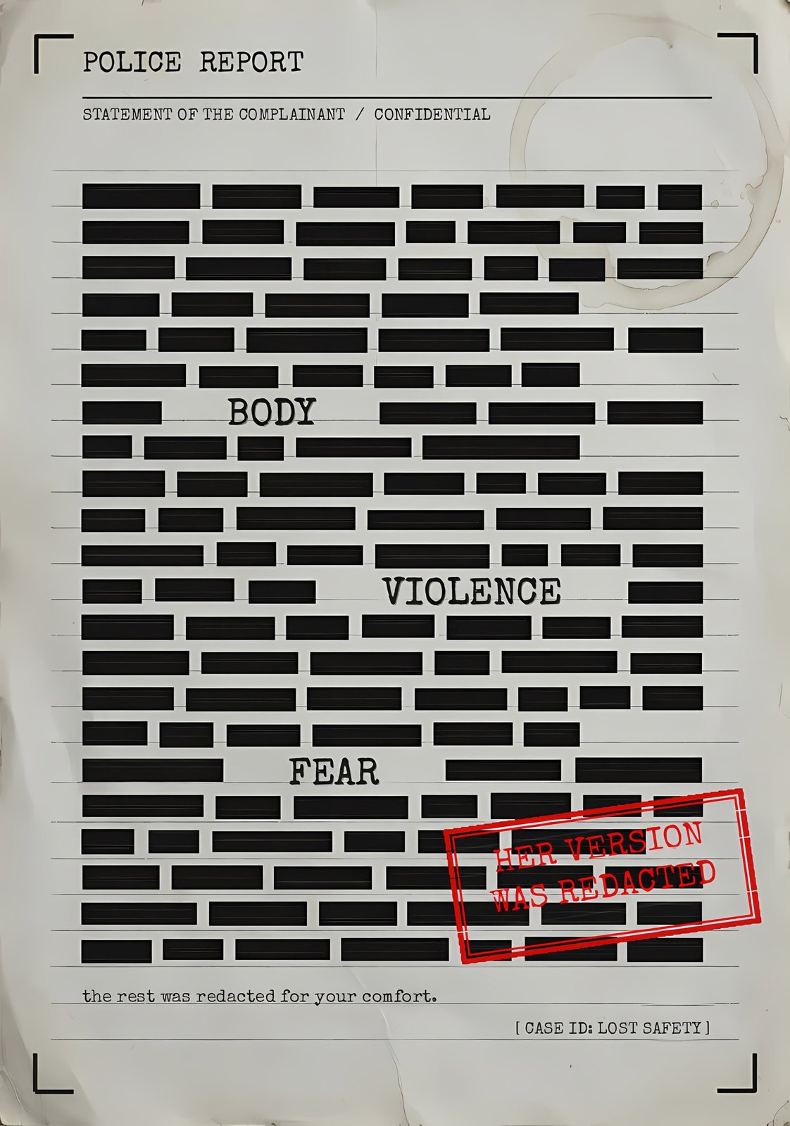
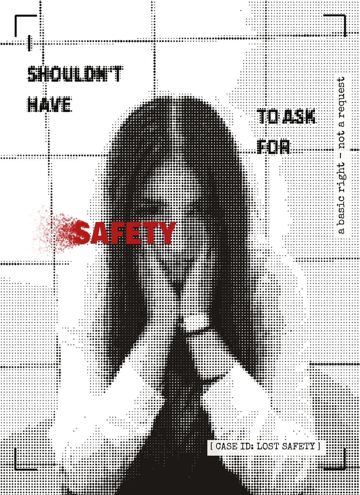
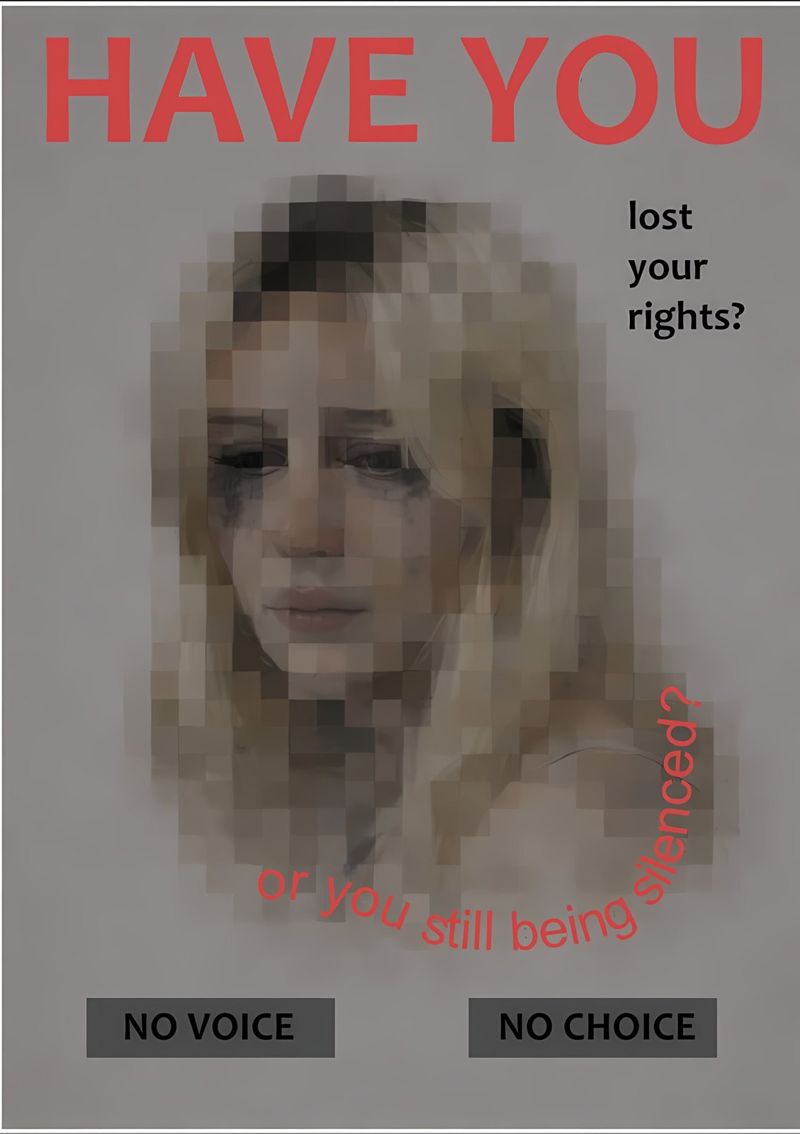
Almost monochrome. Black and paper tone, plus a single red accent that falls only on the key word: CHOICE, ME, RIGHTS, SAFETY, AUTONOMY. Red is blood, alarm and stamp at once.
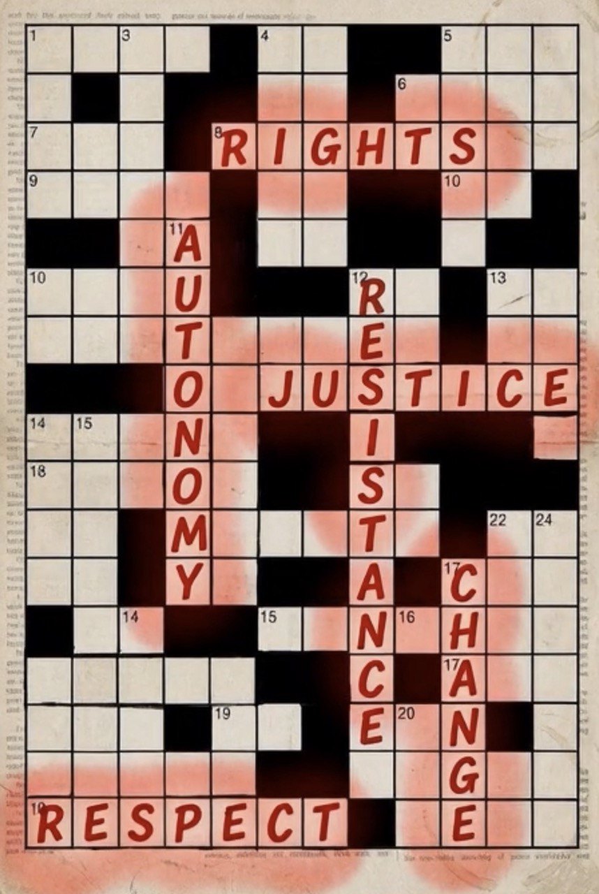
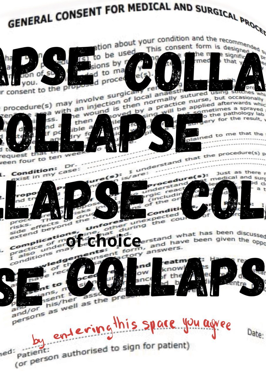
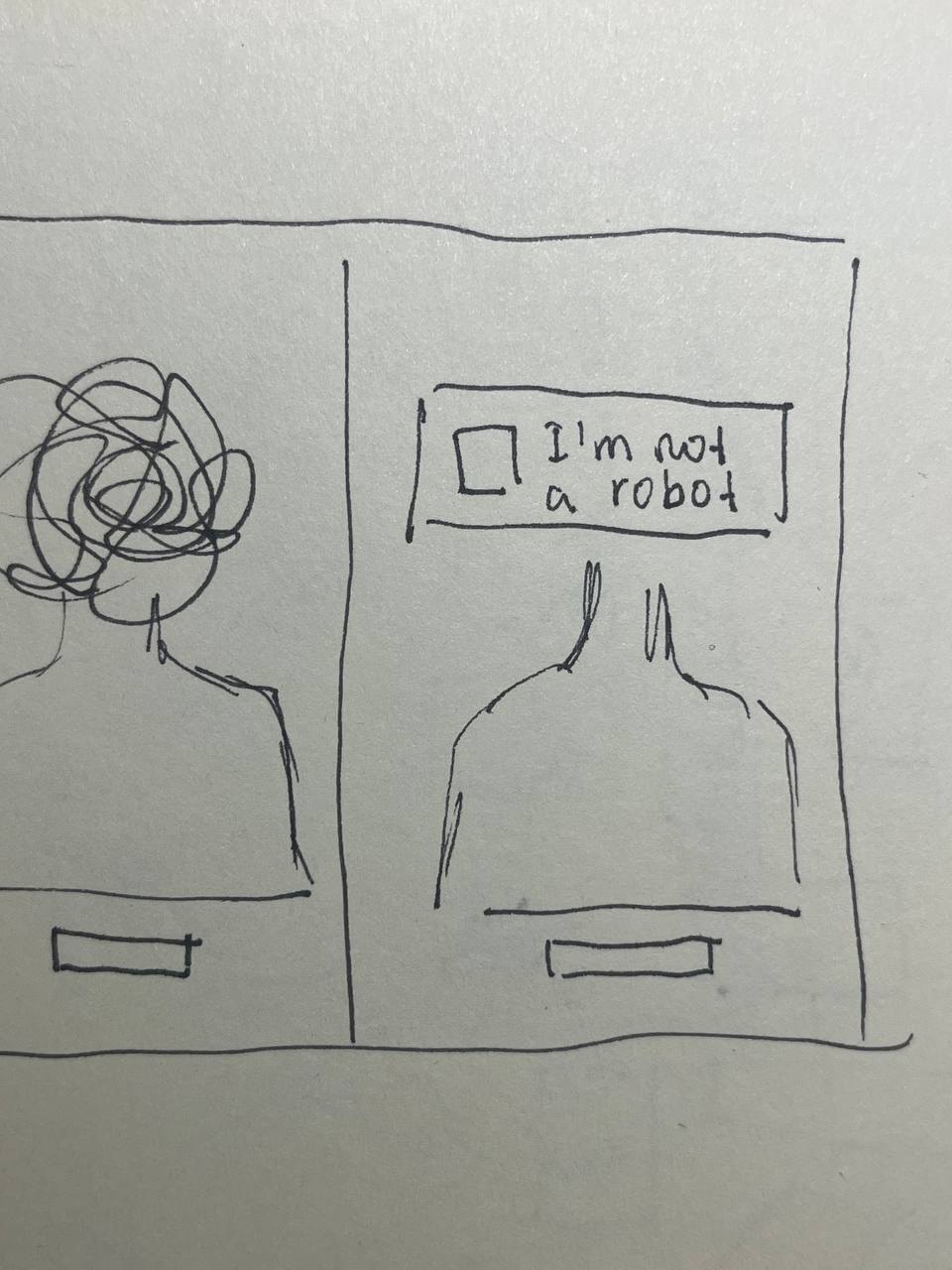
The language of the system. [CASE ID], [EVIDENCE], ERROR / ACCESS DENIED, the “I’m not a robot” captcha, crosswords, dialog boxes, files, the SIGNED BY HER stamp. The aesthetic of an institution that turns a person into a case.
Three typographic voices. A heavy grotesk for the shout, a typewriter for the institution, handwriting for the person.
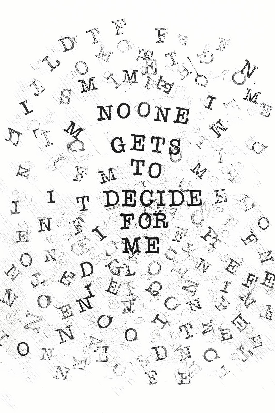
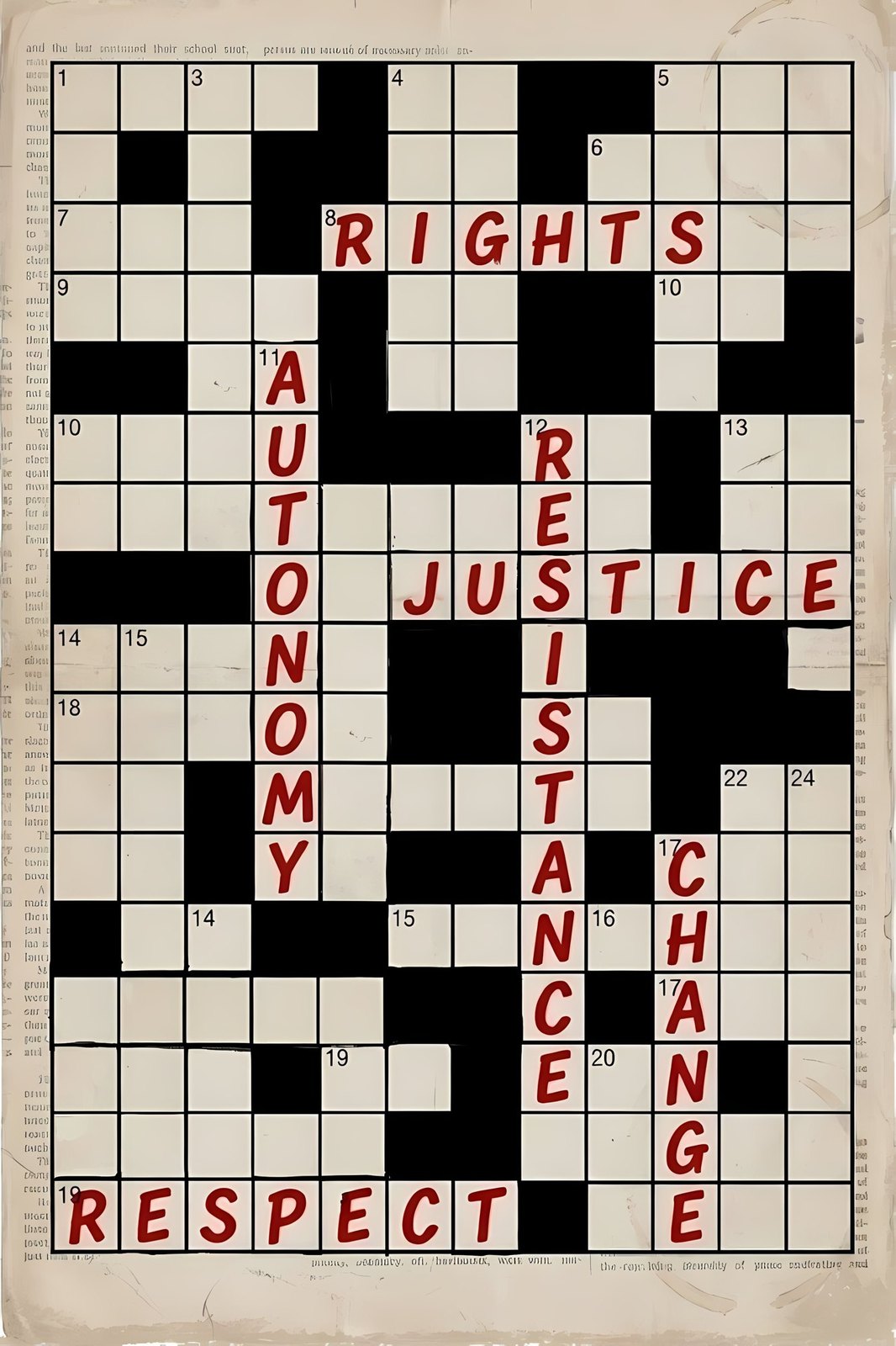
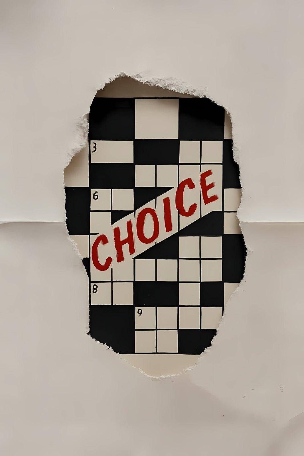
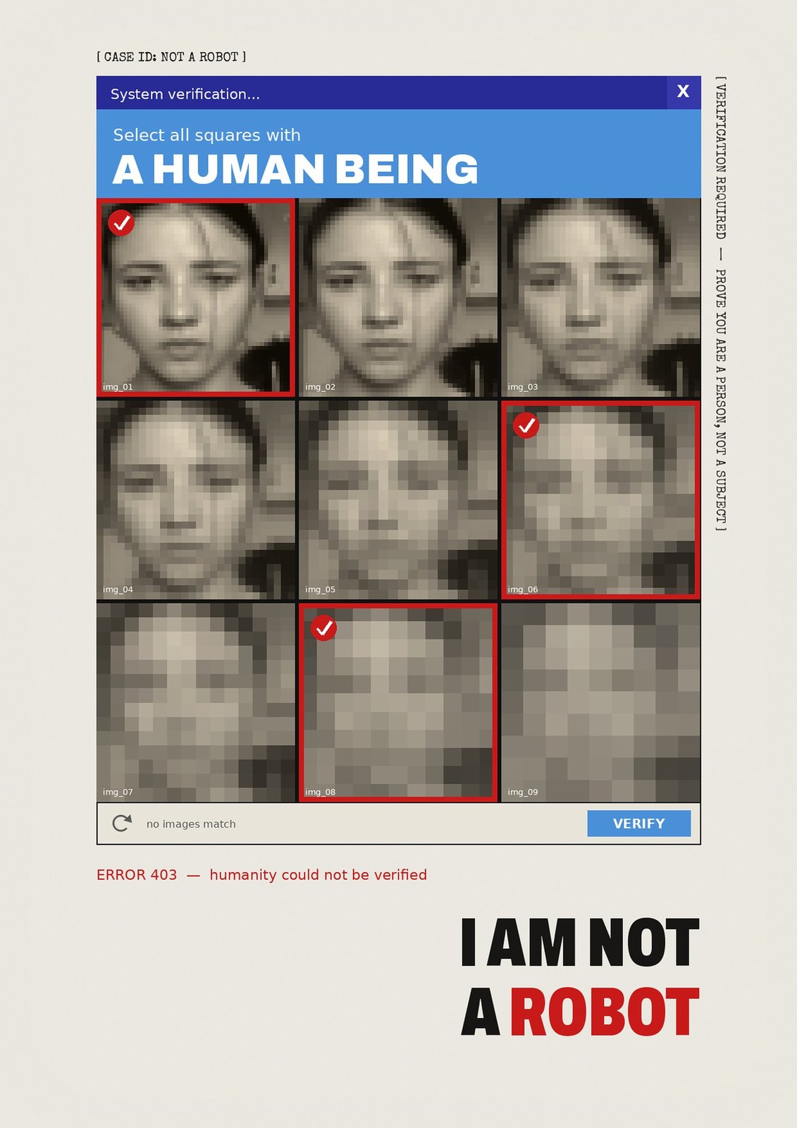
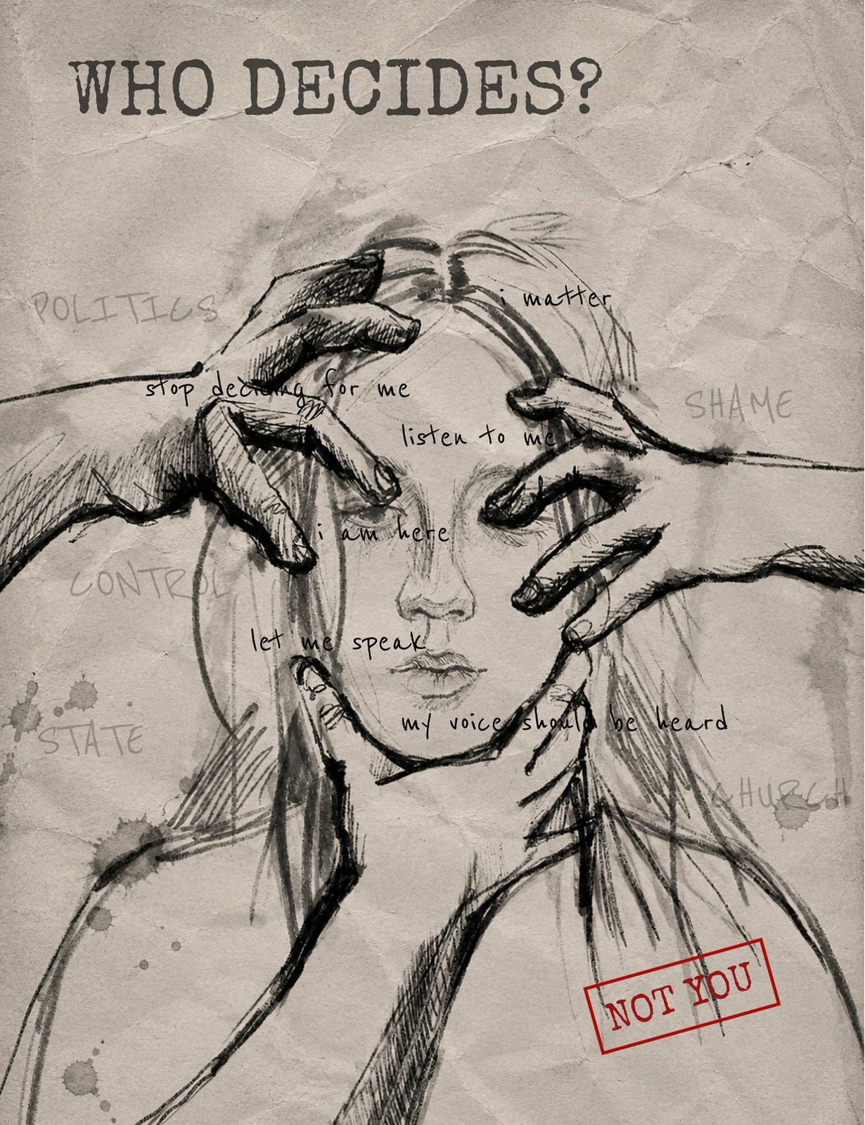
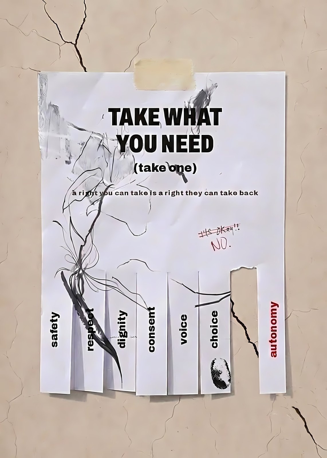
For the exhibition six posters were animated: the captcha keeps failing, the crossword tears open, the letters refuse to settle into a sentence.
Every poster followed the same rhythm: first research and sketching — anatomical drawing, a portrait, a face in hands. Then handmade textures: torn paper, ink blots, fingerprints, red stains printed from a palm. Then the “system enters”: digital error windows, captchas, stamps and black redaction bars laid over living matter. Finally versioning — some posters went through more than a dozen variants before the key word landed in the right place.
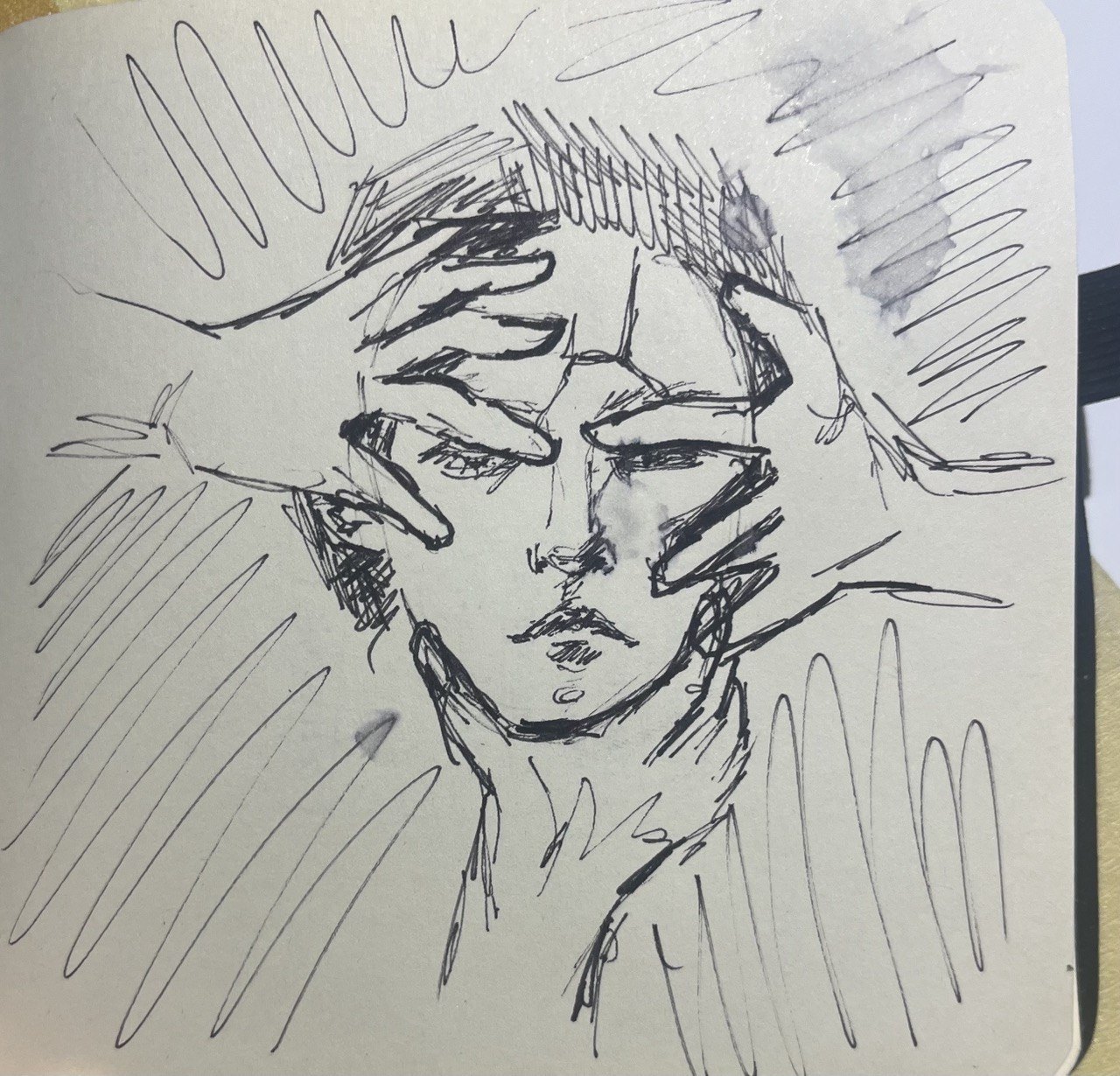
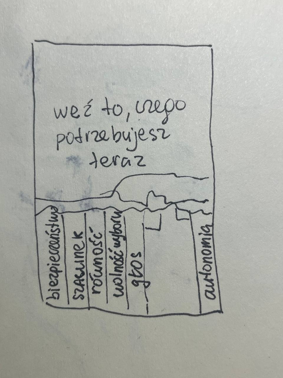
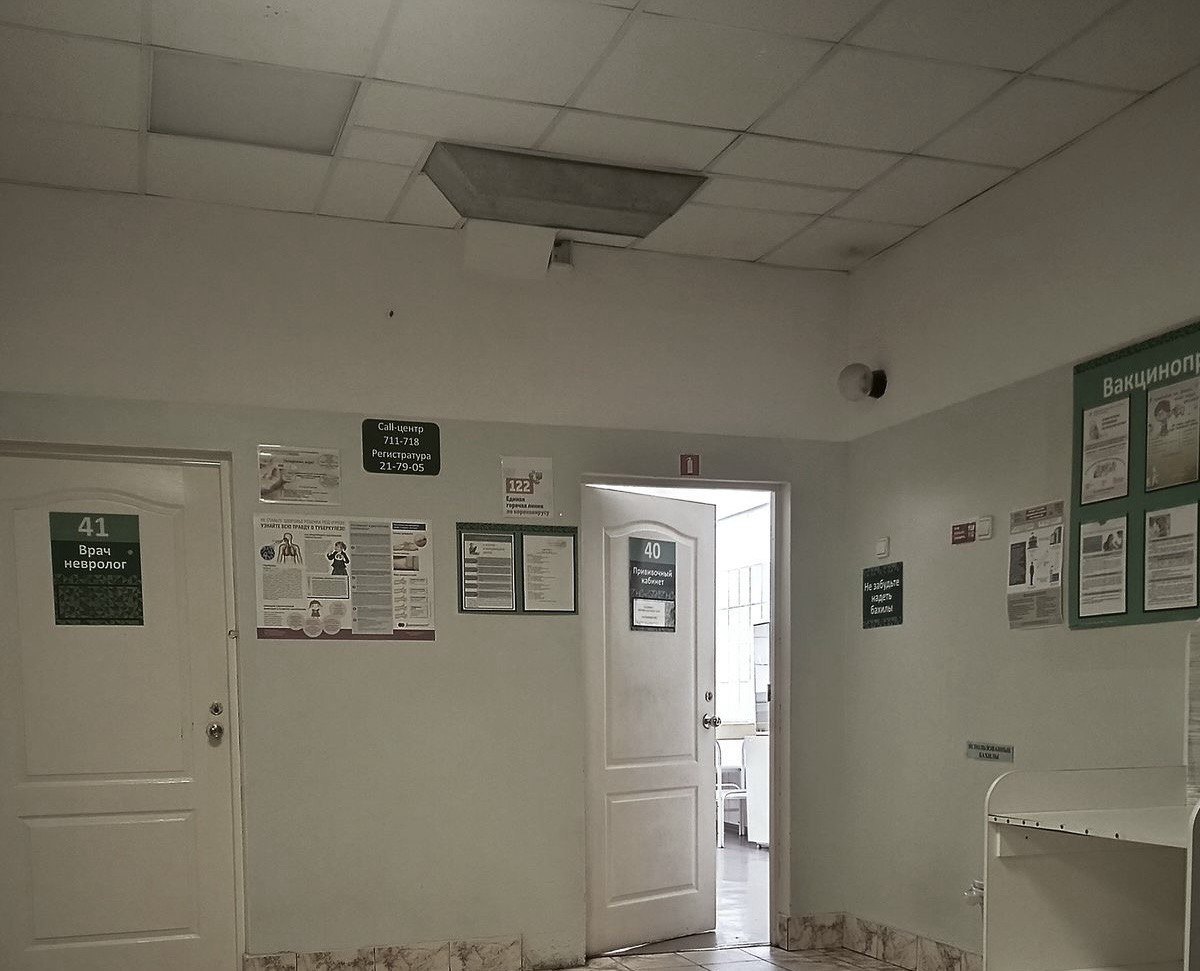
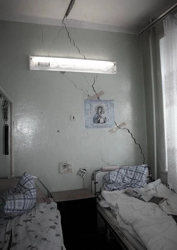
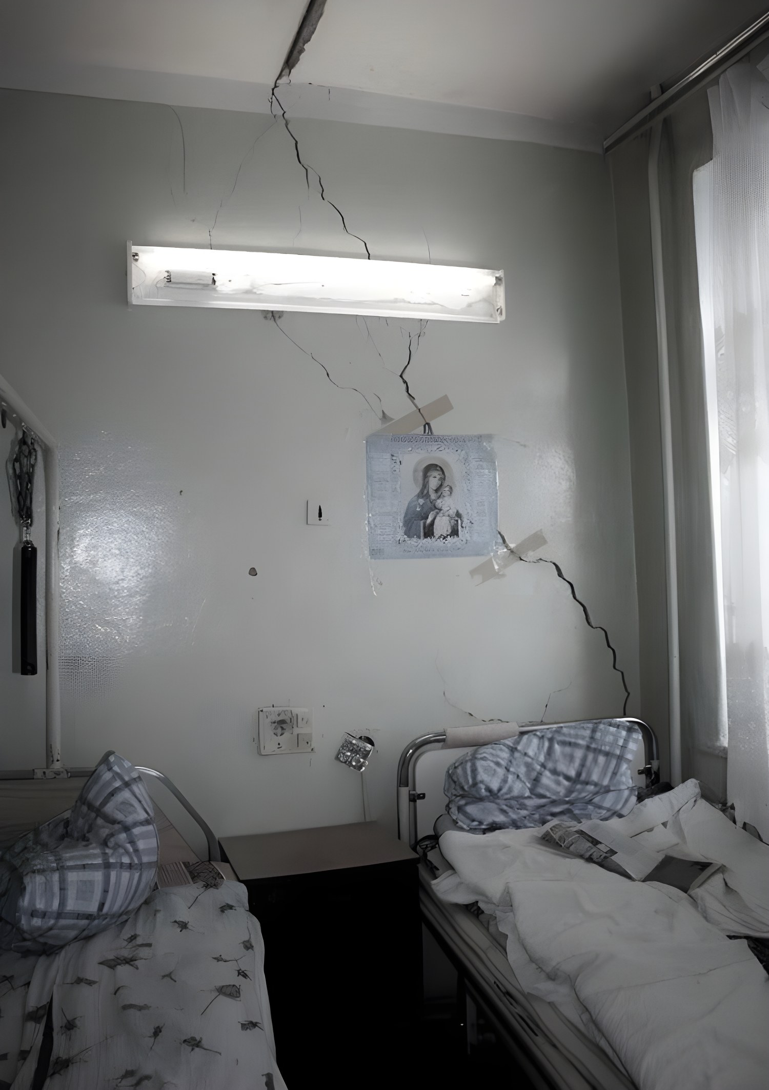
The series is designed as a multi-channel campaign and a spatial installation. In the gallery the posters dialogue with the aesthetic of a sterile hospital corridor: white walls, dressing materials, silence broken by breathing and a heartbeat. “Take what you need” also lives outside the gallery — on a pole, at a bus stop, on a toilet wall — where you can really tear off a strip with a right on it.