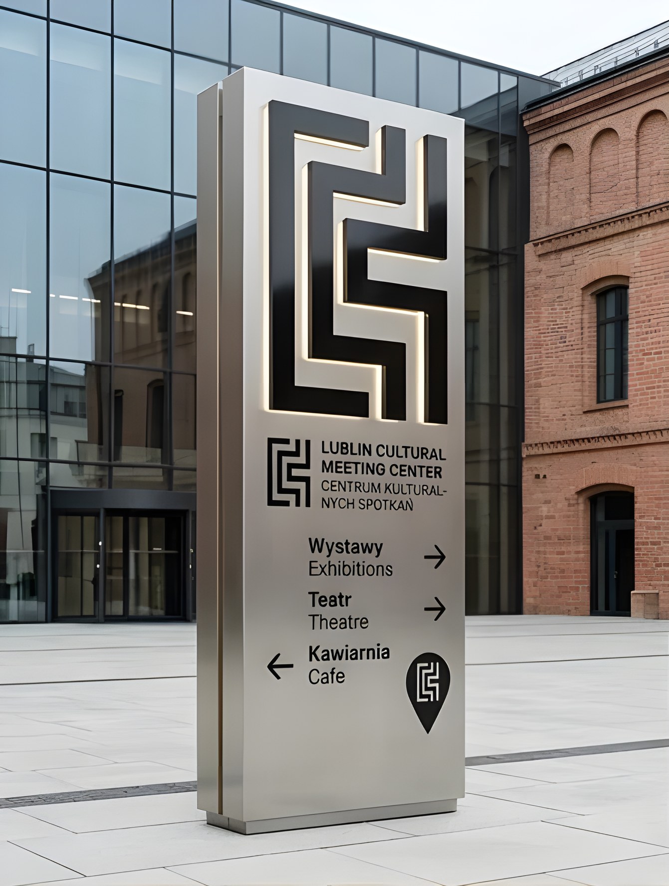
Existing signage had low contrast, no hierarchy and did not match the building’s materials.
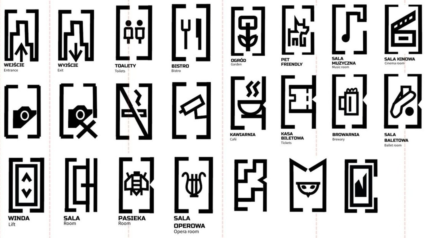
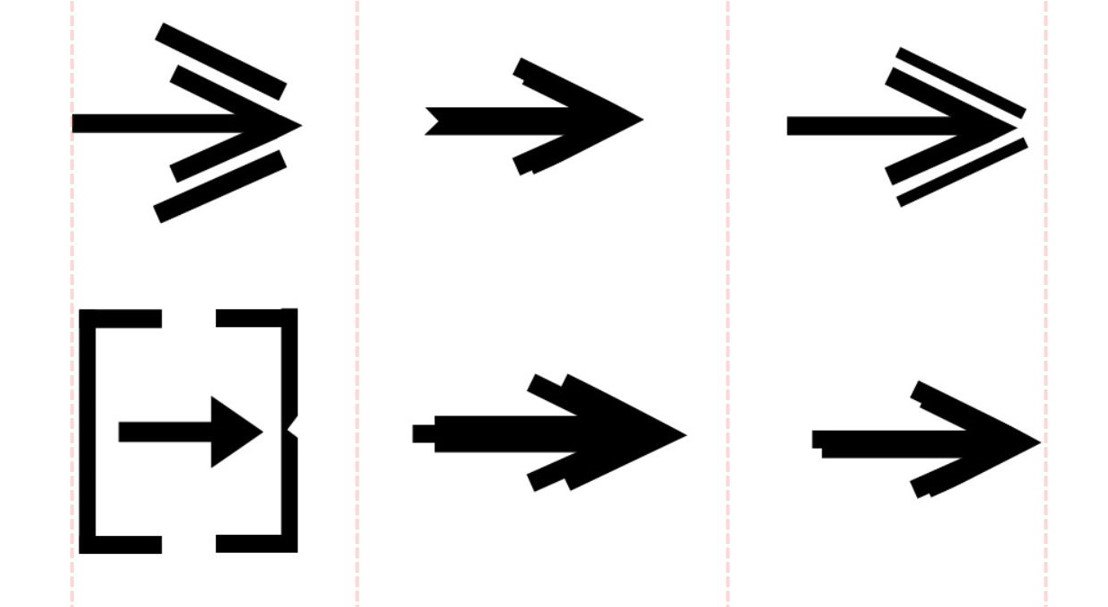
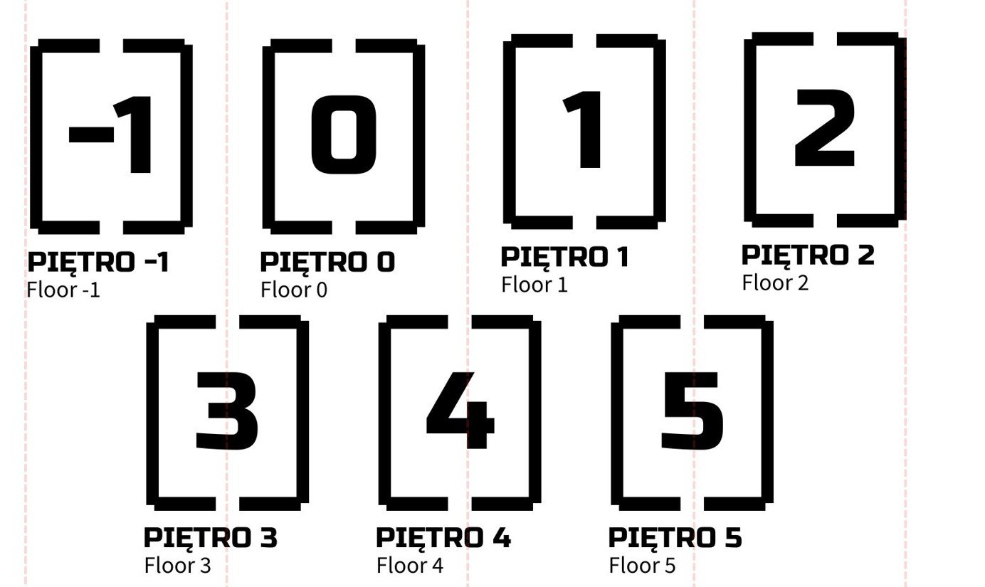
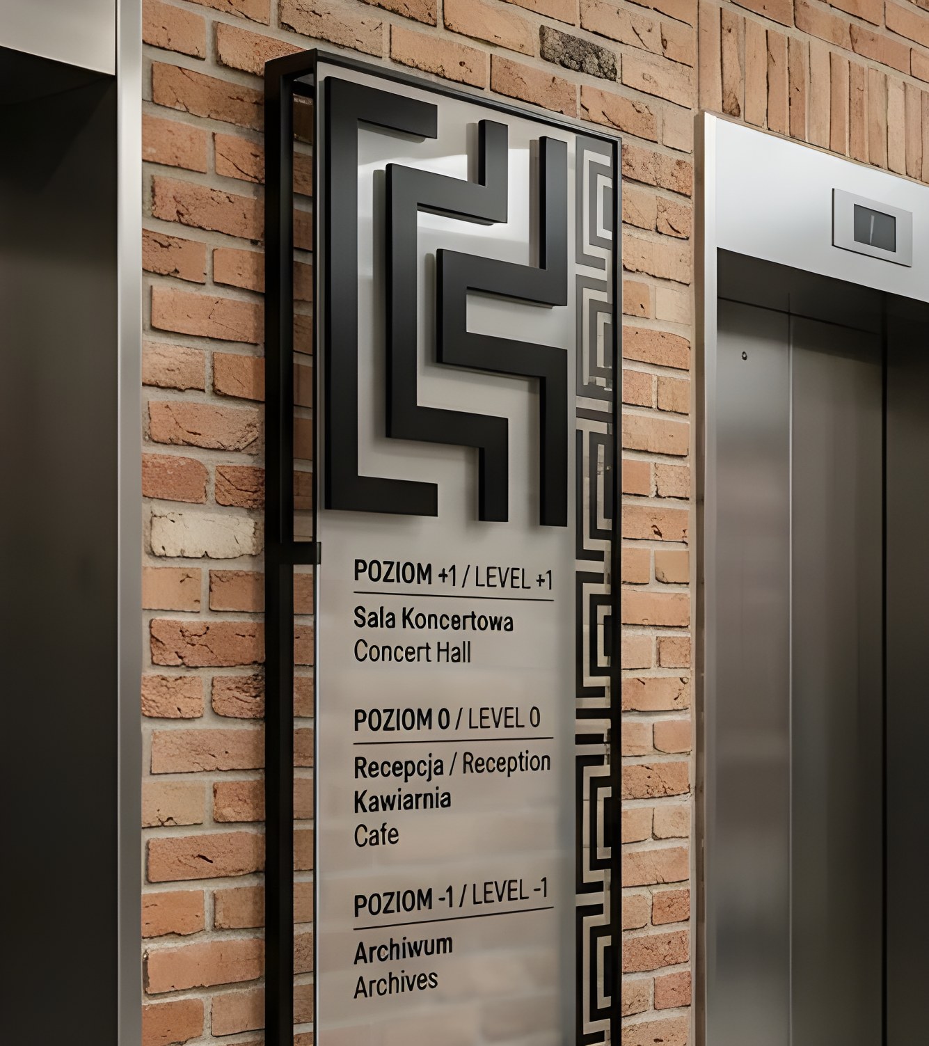
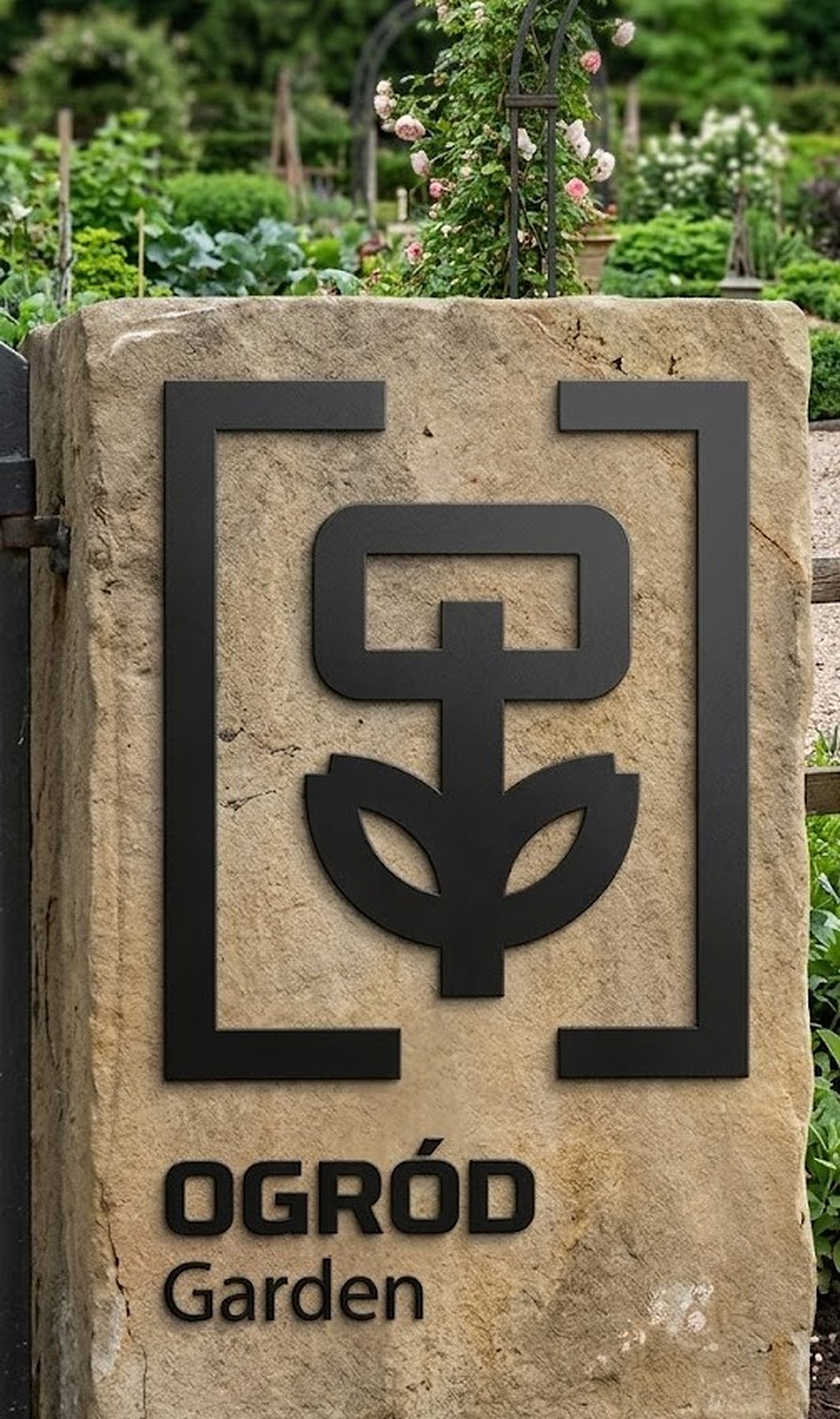
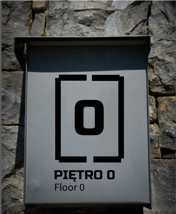
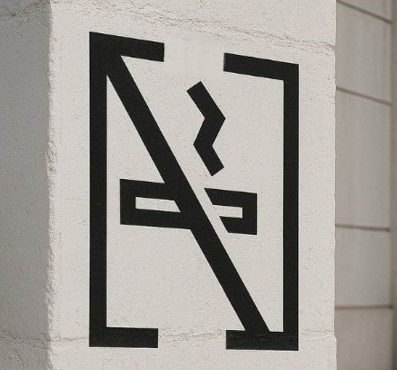
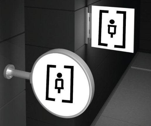
Logo, 20+ pictograms, floor signs, arrows and totem system — from audit to final files.
A single geometric language for the whole building, readable from a distance and in two languages.
The previous signage had low contrast and poor readability, no clear hierarchy of information, and was visually inconsistent with the building’s materials. The goal: a design that is visible, functional and representative of the cultural venue — and that improves navigation for very different visitors.
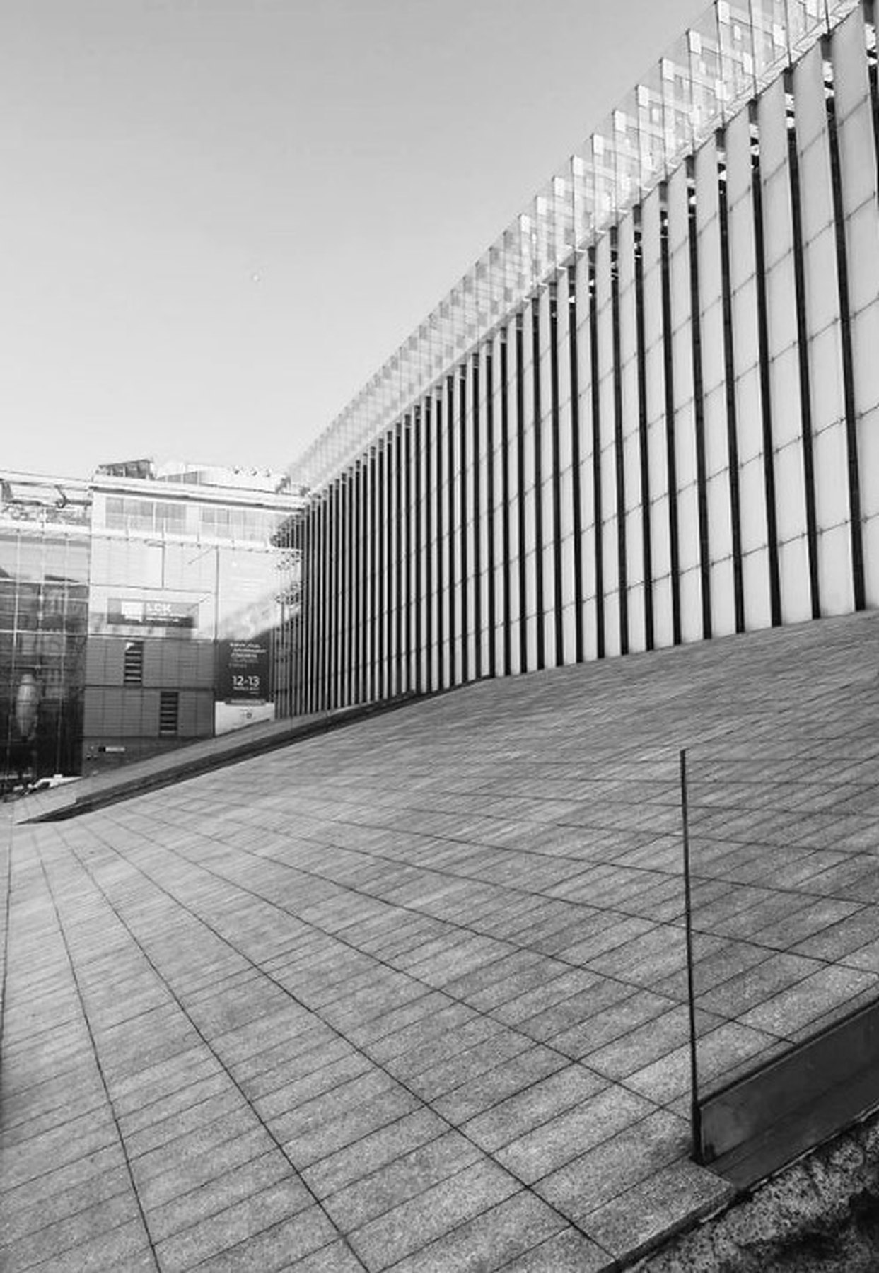
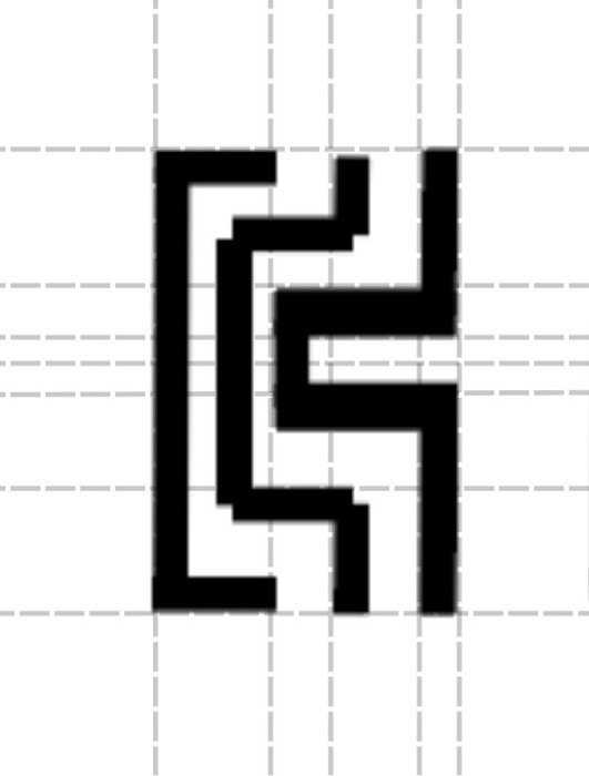
The logo, the pictograms, the arrows and the floor numbers share one geometry, so a sign reads as part of the architecture rather than a sticker on it. Bilingual labels (Polish / English) and high contrast keep it readable from a distance.