The website of the Cultural Meeting Center speaks a different language from its building: 23 location names, three websites and five steps to buy a ticket, visitor information hidden in a wall of text.
Audit of the live site, information architecture, UI built on my wayfinding system, 15 screens for desktop and mobile, concept presentation.
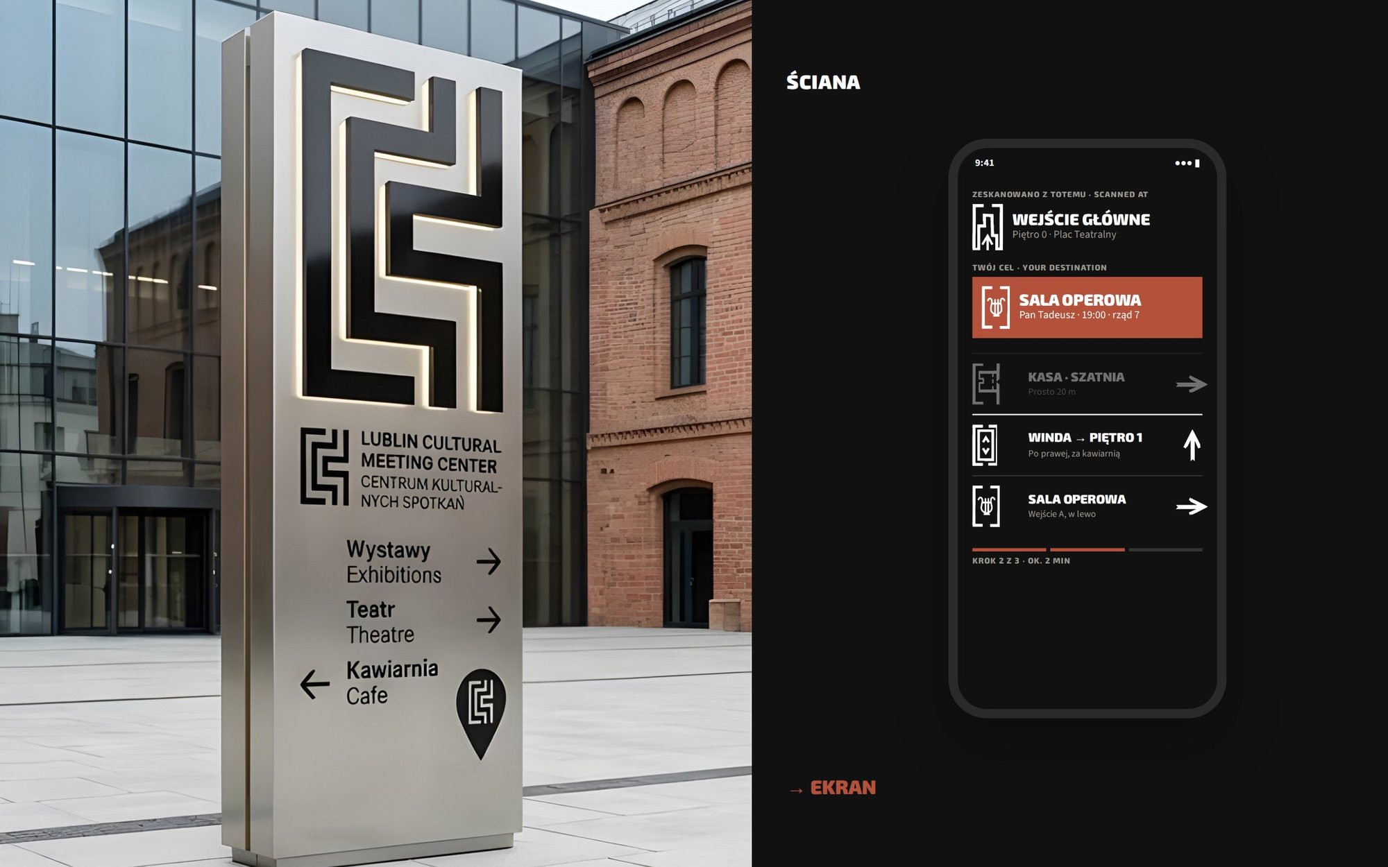
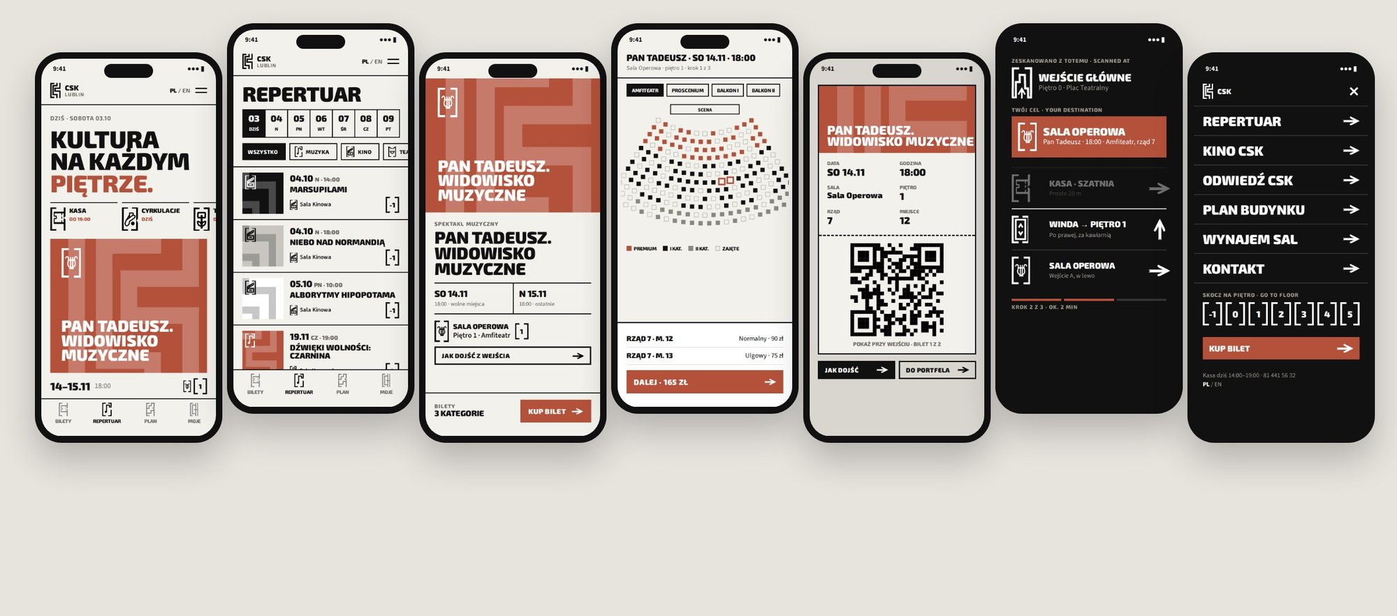
One system from the wall to the screen: floors instead of names, one ticket flow in three steps, the route from the totem on the phone.
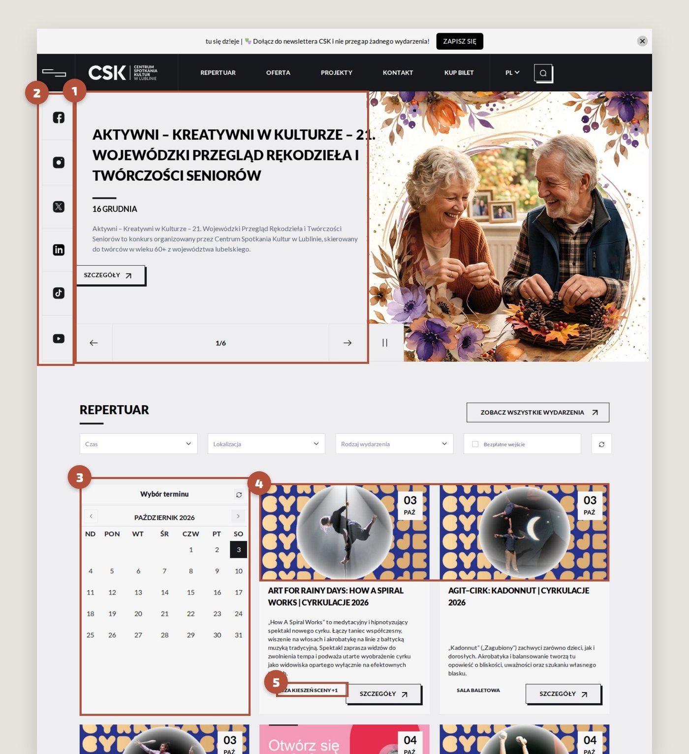
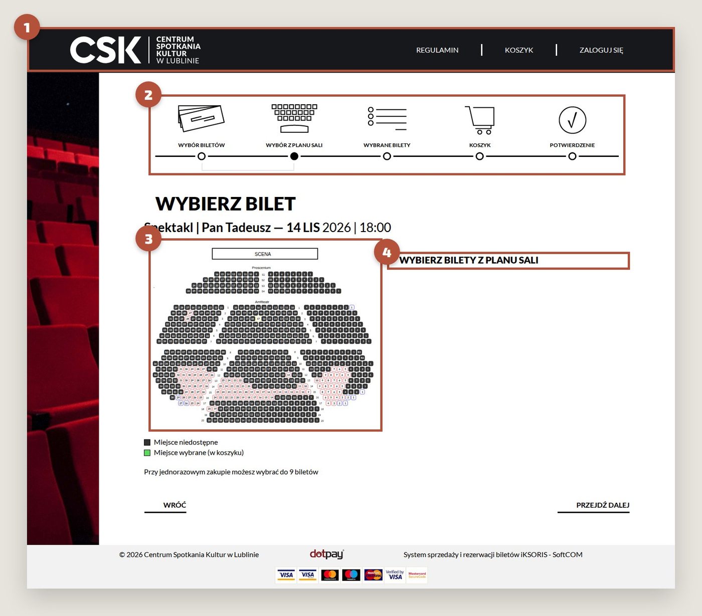
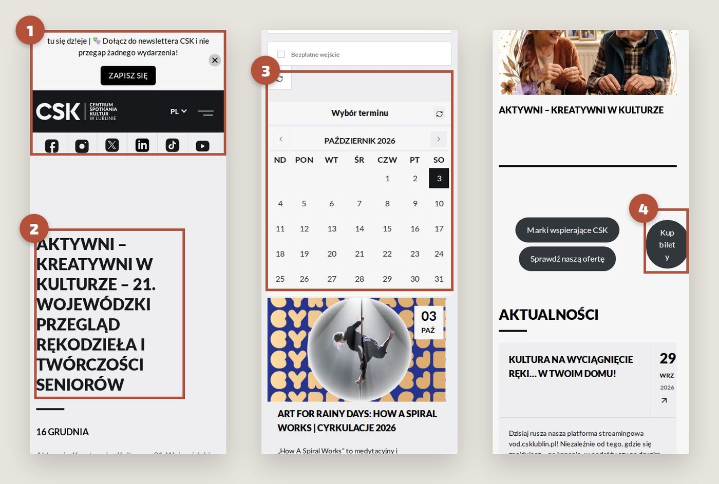
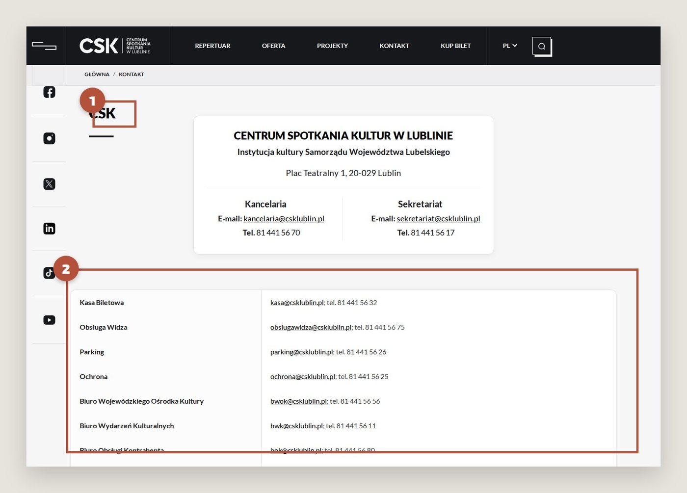
Inside the building, visitors follow one system of signs. Online they meet another: 23 location names in the programme filter, some of them internal jargon; three different websites and five steps to buy one ticket; seat maps without prices; visitor information as 6,900 pixels of continuous text. On a phone the first event appears only after 2.7 screens of scrolling, and the ticket button breaks in half.
I documented each problem on screenshots of the live site, desktop and mobile.
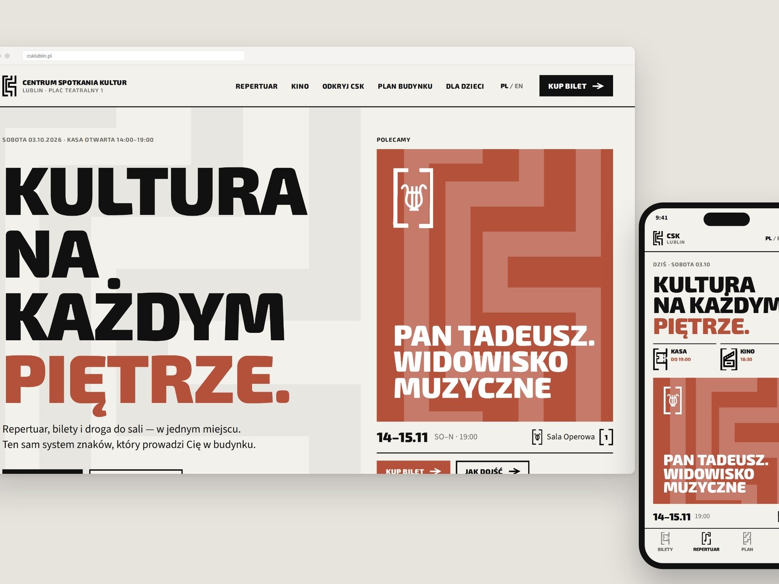
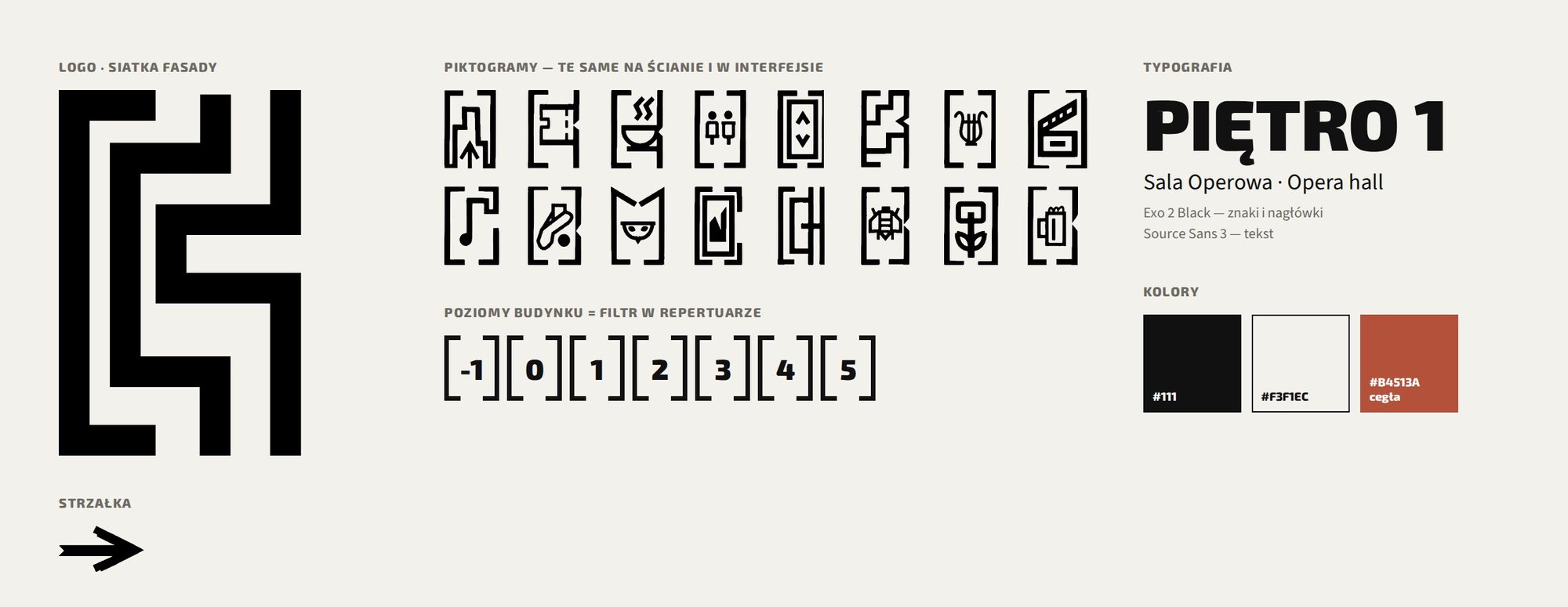
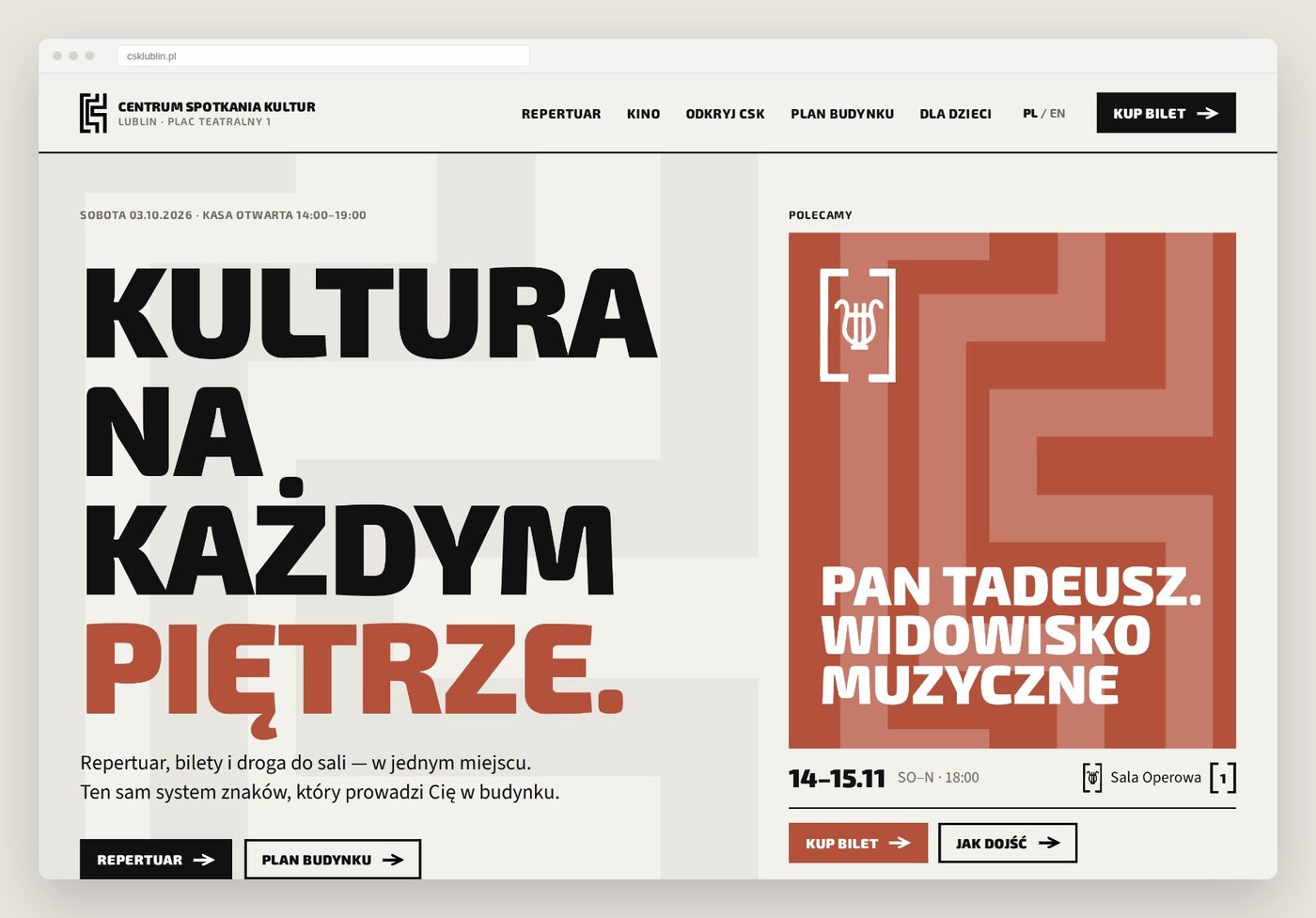
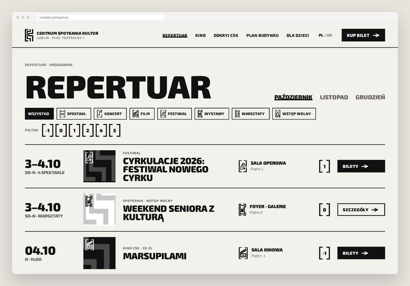
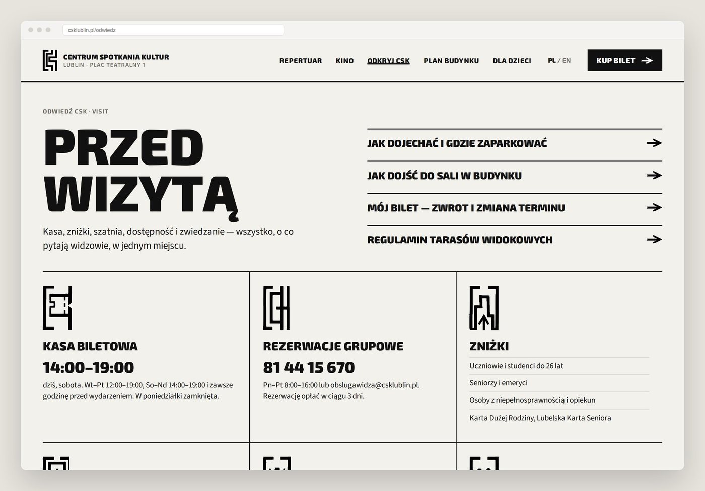
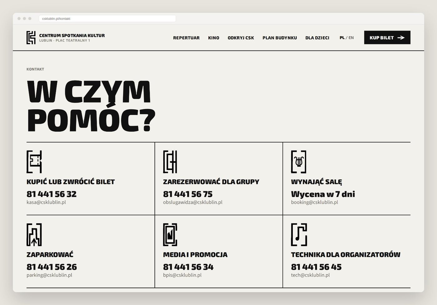
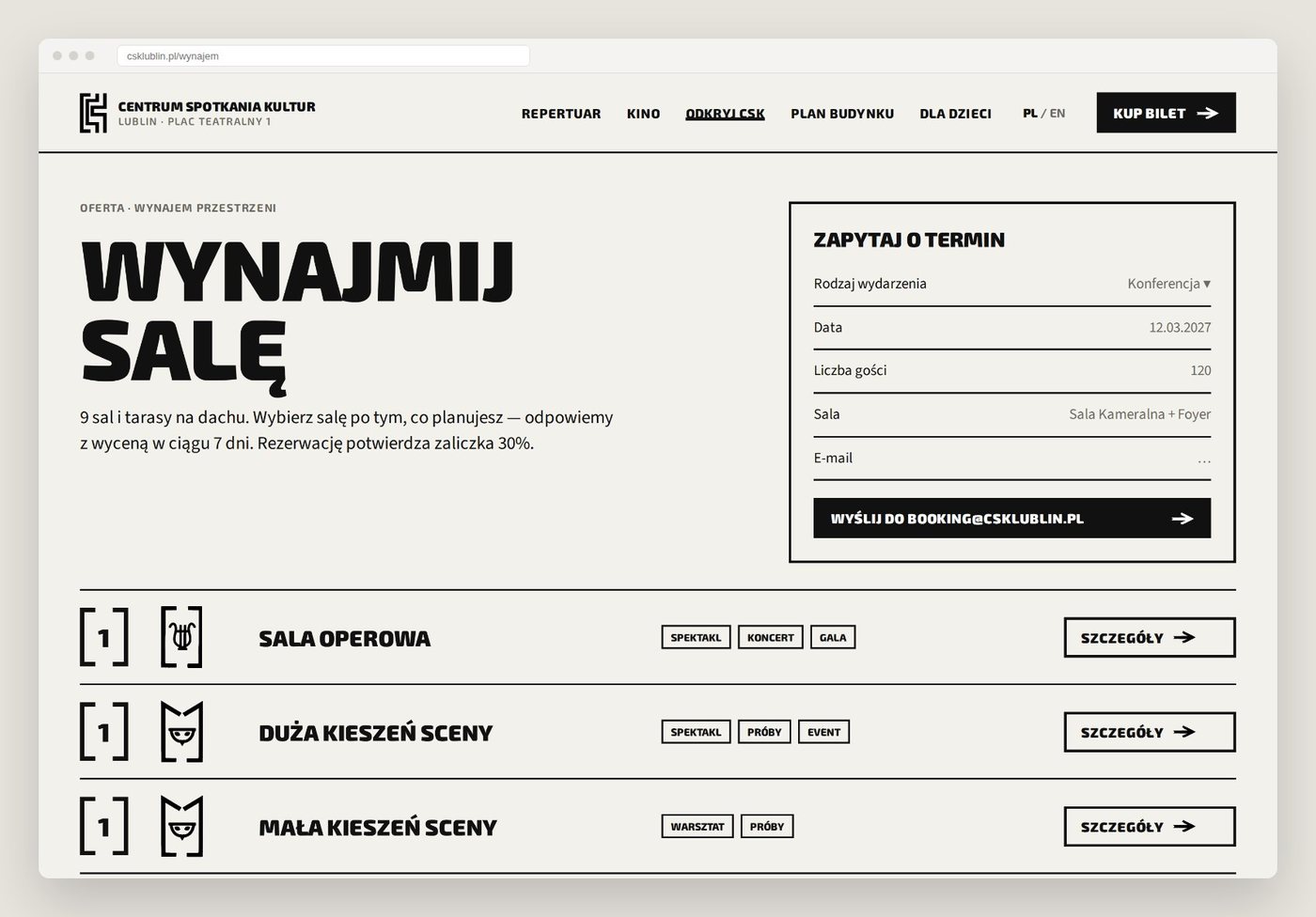
Nothing new to learn: the logo drawn on the facade grid, the pictograms and the floor numbers come straight from the signage. The brackets of the pictogram frames frame every element on screen, and the seven levels of the building replace the 23 location names as the main filter. The only added colour is brick, taken from the facade, and it marks one thing: the next step.
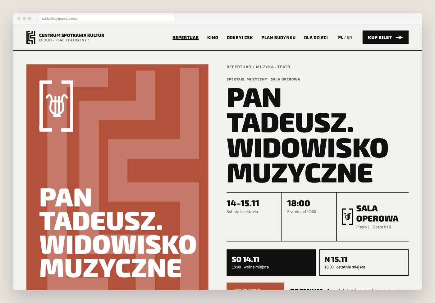
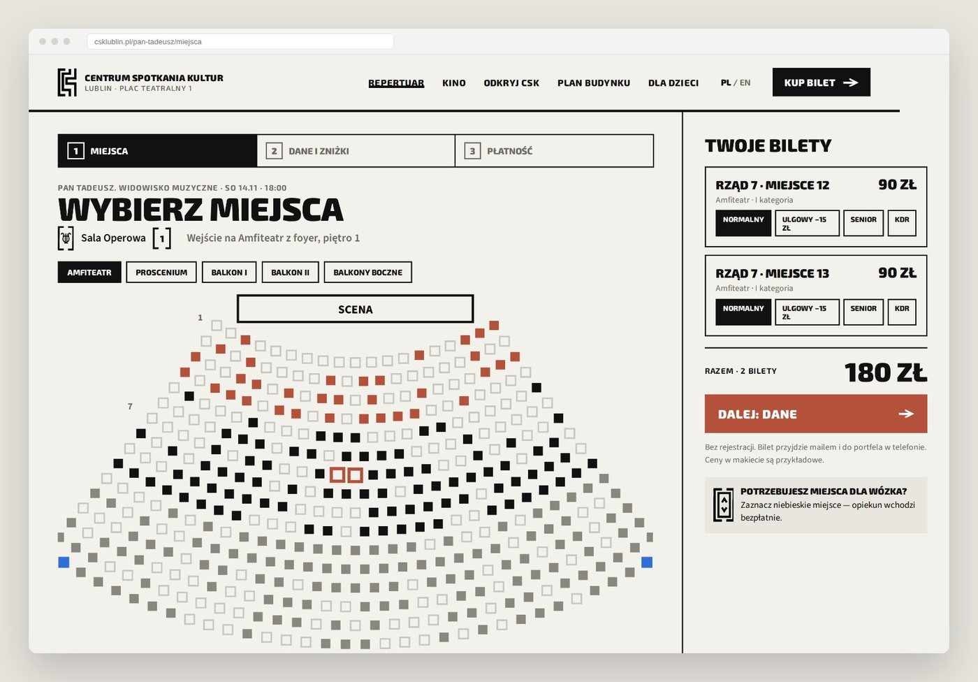
Home shows what is open and on today, hall by hall. The programme lists date, time, hall, floor and price in one row. The event page ends with the route from the entrance to the seat. Tickets take three steps on the same site, with price categories and wheelchair places visible on the map. Visitor information became six cards, and contact starts from what you want to do, not from the org chart.
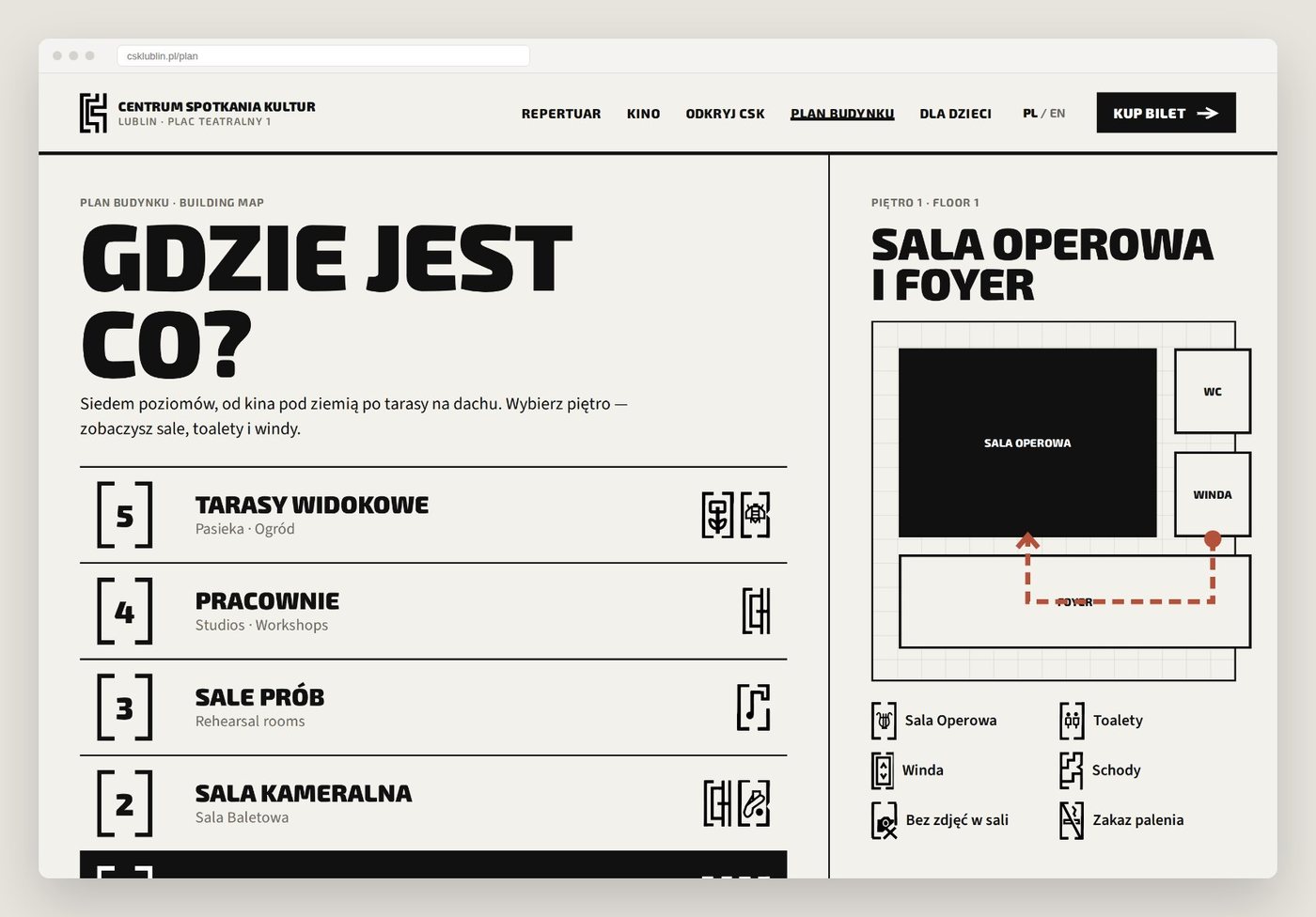
A QR code on the totem at the entrance opens the route on the phone, step by step, in the same signs as on the walls. The ticket lives in the phone too, with its hall and floor.